Sussex Shorthand Training
BRANDING AND DESIGN CASE STUDY
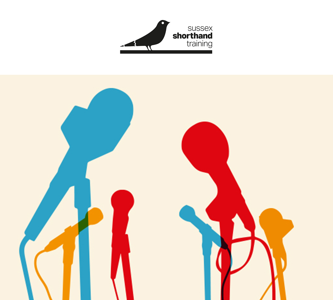
Sussex Shorthand Training is a start-up Brighton based course that had a small budget but wanted an identity that would reflect its locality and specialism. Stressing simplicity was key to creating an identity that was open and inviting to young post graduate journalism students that needed to learn shorthand.
CREATIVE SOLUTIONS
Branding – identity development
Brand toolkit for online and offline marketing communication.
Design – illustrations
Creative stamp to highlight its fresh and friendly approach.
The Creatologist Mix
We do more than brand and design. In fact, we’re one of the only local micro agencies in the South East to offer UX-led design solutions led by industry-leading brand strategists. Big agency expertise with a boutique service. Interesting to know more about our expertise? Click here for more information.
Custom Field
Sussex Shorthand Training brand and design case study
Category
Brand, Design


